

Brand Remastered
Welcome to our remastered brand identity, embracing our rich history and unmistakable heritage.
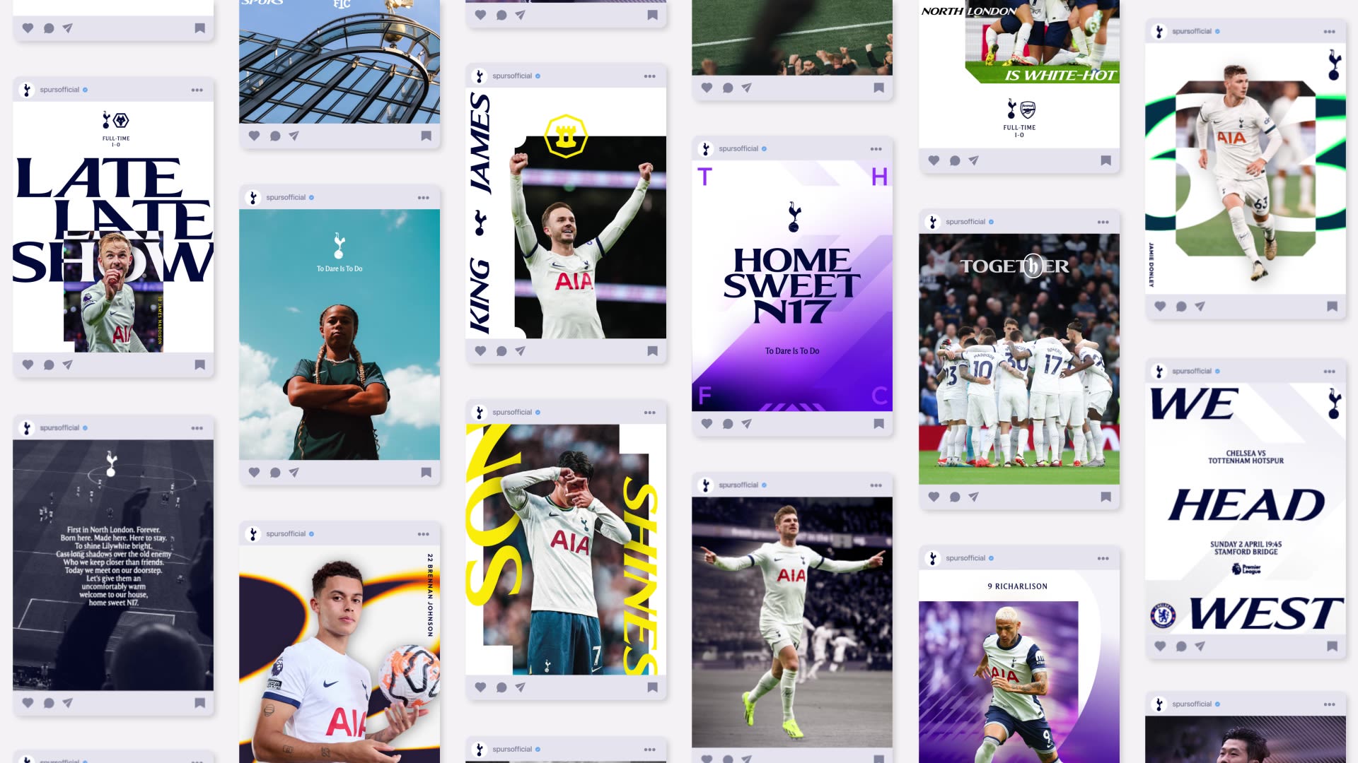
Created with the input of over 300 players, staff and fans to fully understand what Tottenham Hotspur means to them, our new identity enables a more playful, daring approach for the Club’s brand across the multitude of platforms on which it now features, with a particular focus on clarity in digital environments.
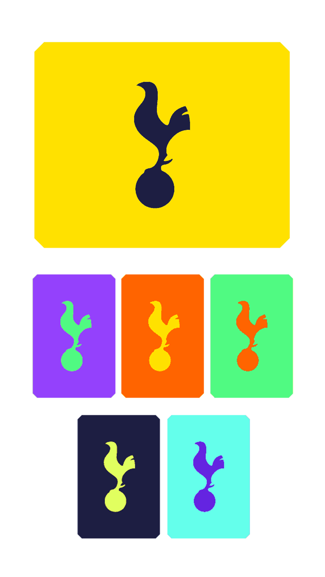
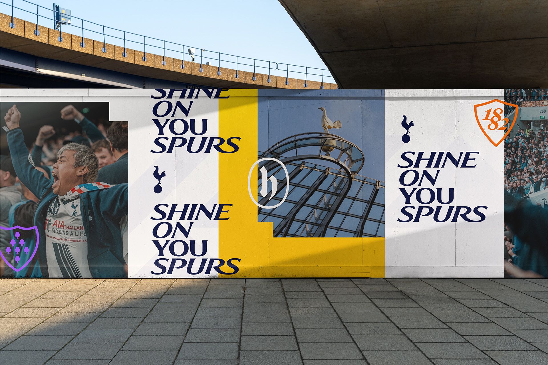
The world-famous cockerel stands prouder than ever and is supported by a silhouette version, along with the reintroduction of the THFC monogram and new colours, patterns and hallmarks linked to the Club’s heritage.


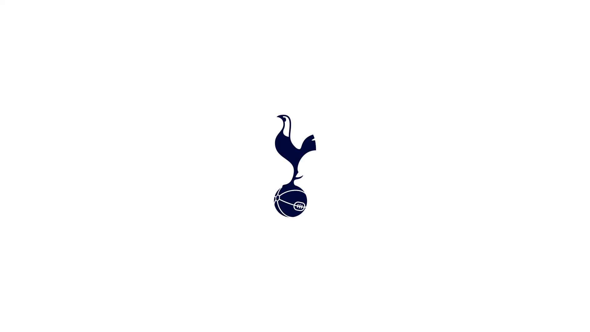
Club Logo
A Club of firsts, Tottenham Hotspur took an unprecedented step in 2006 to modernise its identity by simplifying the badge around its world-famous cockerel, that has since stood alone in minimalistic, iconic fashion and which other clubs are now doing.
We have removed the curved ‘Tottenham Hotspur’ text from beneath the cockerel. This enables us to increase its scale across different environments and stand proud as a true icon for the Club.
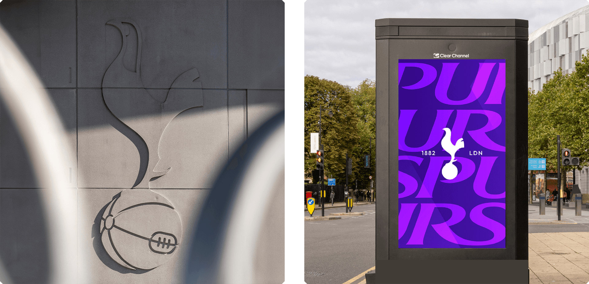
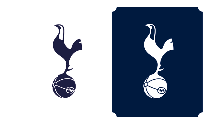
Brand Logo
The cockerel is now supported by a silhouette version that allows for a more playful expression of the brand.


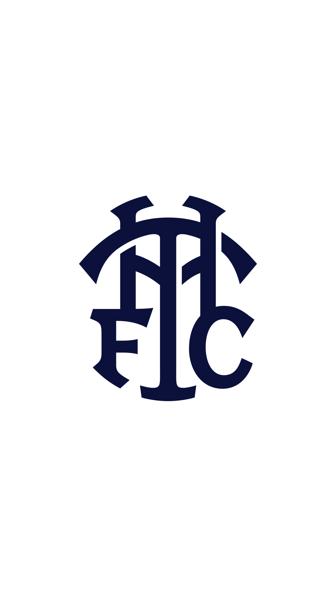
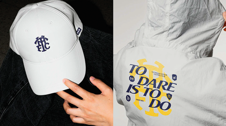
Reintroducing our Monogram
A truly iconic part of the Spurs brand for nearly 60 years – a fan favourite from the 1950s that went on to feature heavily on the Club’s badge for many years. The monogram has a special place in our history, now remastered for our future. THFC.

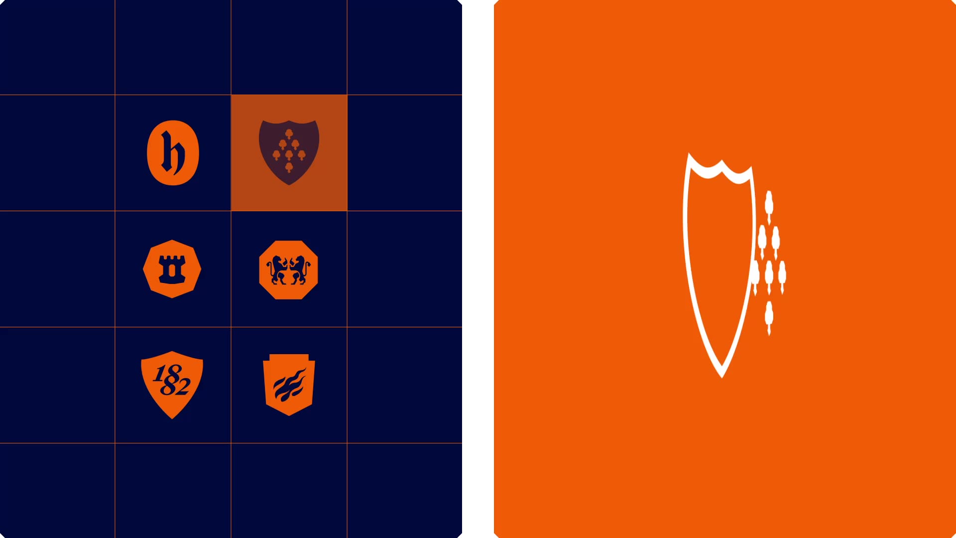
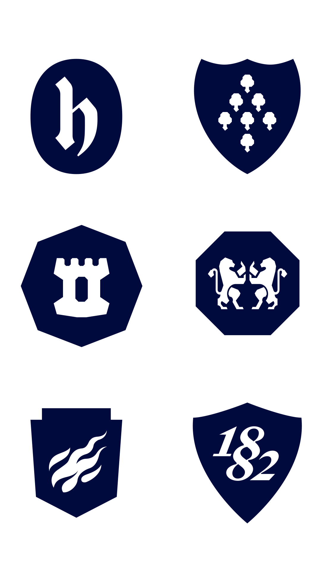
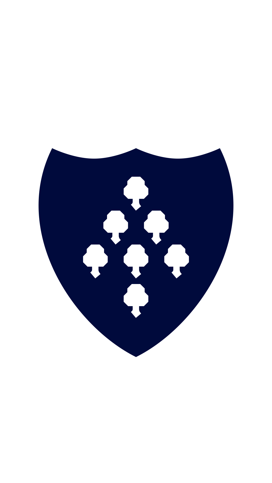
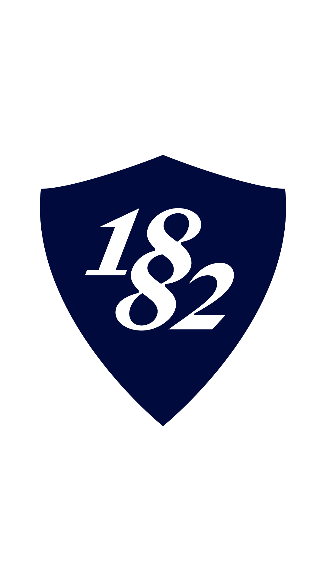
Hallmarks
We have developed a suite of hallmarks to celebrate key heritage features, including the Seven Sisters Trees, Bruce Castle and 1882 – the Club’s founding year - to support our brand storytelling.
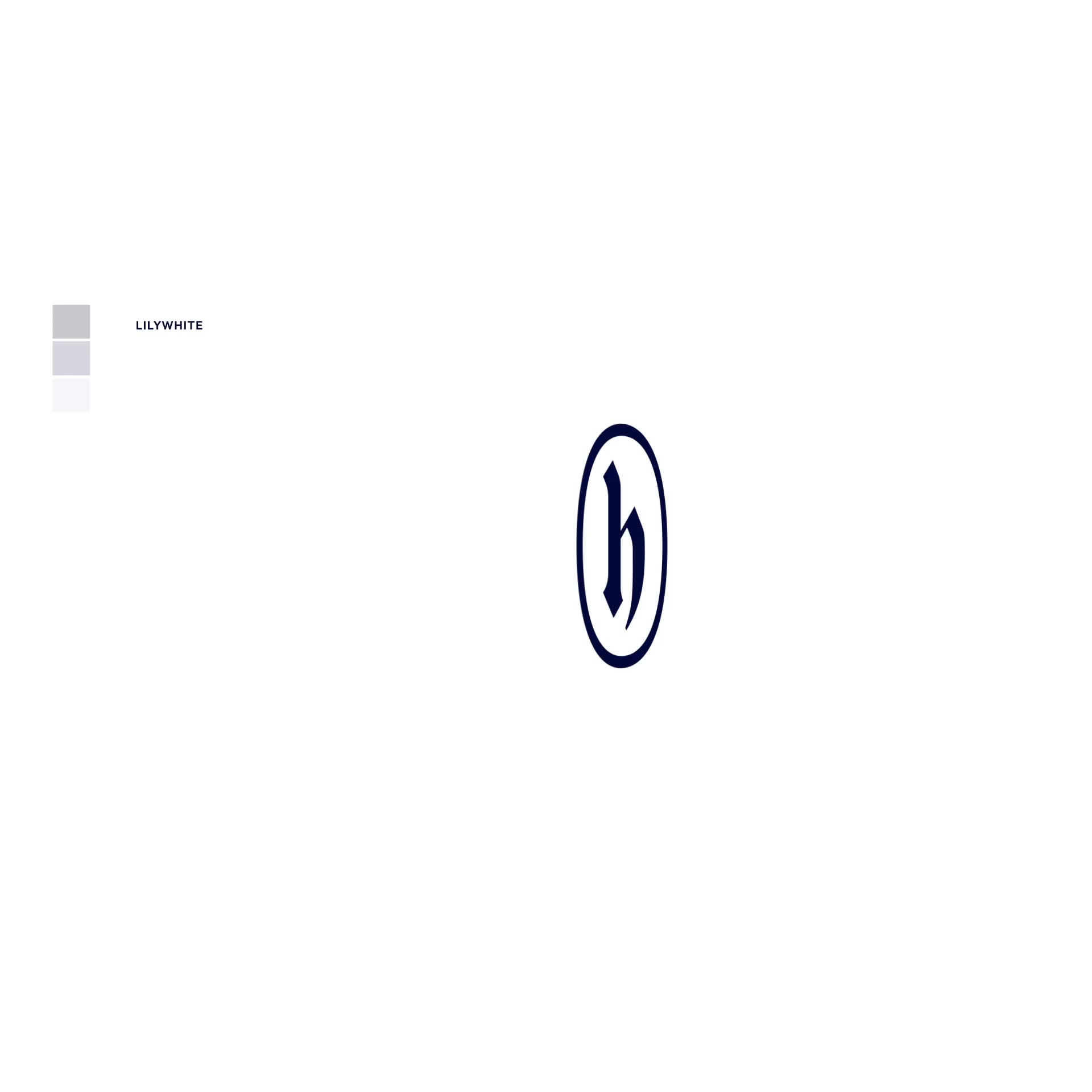
HOTSPUR ‘h’
Taking inspiration from medieval nobleman Sir Henry Percy – aka ‘Harry Hotspur’ – who the Club was named after by its founders.
SEVEN SISTERS
The famous seven trees in N17, known as the Seven Sisters which adorned our previous club badges.
TWO LIONS RAMPANT
The Two Lions Rampant are taken from the crest of the Northumberland family who feature heavily in the history of the local area.
BRUCE CASTLE
Another feature from the old club crests. The round tower of Bruce Castle in Lordship Lane, Tottenham.
WHITE-HOT
Paying homage to the old shield that graced the East stand of White Hart Lane, below the golden cockerel.
EST. 1882
Celebrating the year our great Club was founded.


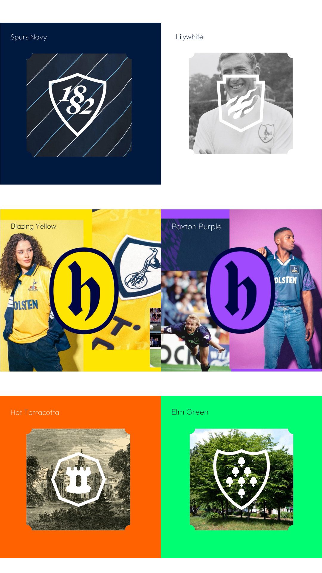
Colour
Ever since our home kit from 1898, the signature combination of Lilywhite and Spurs Navy have always been our core set of colours, and remain ever present to this day. A new palette of supporting colours have been introduced, which are inspired by iconic elements of the Club’s history.

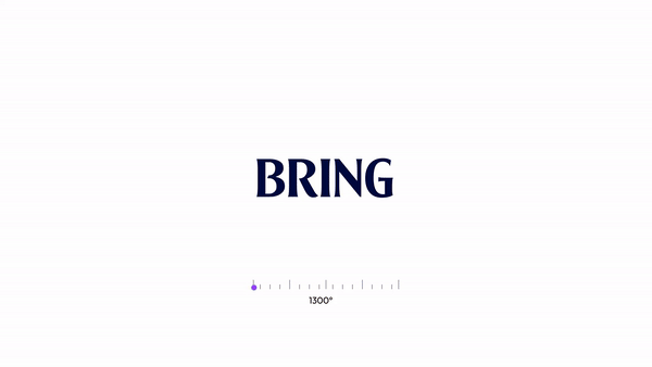
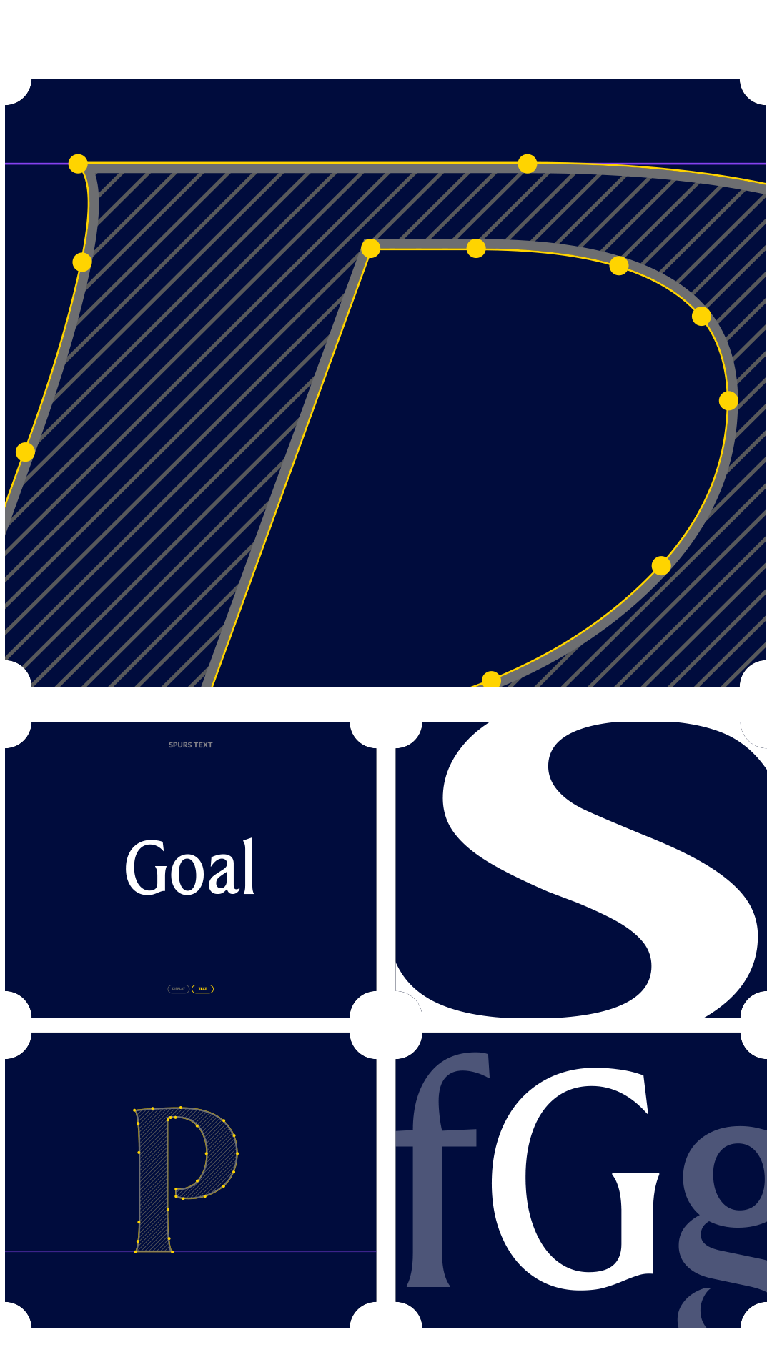
Our Font Remastered
Our font was specially created for the Club nearly 20 years ago and has become synonymous with both the Club and brand. As such, we have evolved our typeface so that it retains its iconic and recognisable style, with a modern twist which is adaptable. New design features have been inspired by our famous cockerel together with special characters, ligatures, and expanding the text to include new widths. Plus, we’ve also introduced a lowercase version for longer-form copy too.